My criteria for choosing interior design sites was the aesthetics of the furnishings, decor, etc. If the site contained items that were not of my liking, I generally did not choose the site to post. If the items were something that I would like to use in my own home was a large part in the decision to post.
I really like Decor Happy because it has a variety but still all in my aesthetic liking. Too much of a variety makes me lose a sense of focus.
Friday, June 29, 2012
Thursday, June 28, 2012
Design Ideas
 |
| I like this chair because it looks comfortable. |
 |
| An inviting white couch is what I've always wanted. |
 |
| I love everything about this couch and wall decor! |
 |
| This one is more simple but is smaller which may work better in my space. |
 |
| I love the mix from crisp and crackle. |
 |
| I like the color wood here. |
 |
| LOVE this linen chair. |
 |
| A neutral decor for either room. |
 |
| This would be a great room divider! Would like it in a light wood. |
 |
| This would be a nice accent for room decor/media. |
Monday, June 25, 2012
The Last Principles of Design
PROPORTION
UNITY
VARIETY
--dm
UNITY
VARIETY
--dm
Redesigning a Room
Don't judge these photos.
1. I plan to redesign this room.
2. I plan to make this room a more functional room. It is large and needs to have the space used to its potential.
3. This room is for my boyfriend and I and it is a living room and dining area.
4. It is needed to improve the function of the space.
5. I will proceed by clearing out the space, perhaps adjusting some doors or windows, and changing color and placement of furniture.
--dm
Thursday, June 21, 2012
Designer Links
My criteria for choosing designers was first of all choosing a site that was aesthetically pleasing. As a designer website, I find it very important for the website to give some sort of sense of good design even though they may not do graphic design. Secondly, I briefly went through the galleries or photos on the websites to see if the designer's designs could potentially be something for me.
Cullen and Co. is my absolute favorite designer out of the ones I posted. It is my favorite because it grasps me at first glance. The photos are one of a kind and show detail of what is possible with this designer and I love it!
--dm
Cullen and Co. is my absolute favorite designer out of the ones I posted. It is my favorite because it grasps me at first glance. The photos are one of a kind and show detail of what is possible with this designer and I love it!
--dm
Some Principles of Design
Balance
SYMMETRICAL
ASYMMETRICAL
RADIAL
Emphasis
COLOR
 |
| 1. Here, the emphasis is the pop of pink on the otherwise dull table. The eye is drawn to the pink. 2. The teal drawer is the focus of this image. |
SHAPE
 |
| 3. The diamond shapes at the top of this mirror catch the eye and elongate the mirror. 4. The oval mirror is the focus of the picture and the eye travels after. |
SCALE
 |
| 5. The over-sized headboard is the focus of this image. 6. The bench here has a large back that is the emphasis. |
Repetition & Rhythm
 |
| 5. The pattern in the pillow repeats throughout creating movement. 6. The ceiling tiles repeat multiple times creating repetition. |
Movement
--dm
Wednesday, June 20, 2012
Texture & More Space
Texture
Space...Again
ACTUAL
IMPLIED
Space...Again
Tuesday, June 19, 2012
Form & Space
GEOMETRIC
 |
| 1. The pine cone is a natural form. 2. The logs are a form in nature. 3. The light sticks are a man-made form of something natural. 4. Of course, flowers are a natural form! |
ABSTRACT
NON-OBJECTIVE
STATIC
DYNAMIC
Space
ACTUAL
 |
| The walls show that this is an actual interior space. |
IMPLIED
 |
| With the rug, chairs, couch, and coffee table, this presents an implied space. There may not be walls but the lines are implied. |
--dm
Monday, June 18, 2012
Shapes & Planes
Shapes
GEOMETRIC
 |
| 1. Circle 2. Square 3. Oval 4.Square |
 |
| 5. Rectangle 6. Diamond |
 |
| 7. Rectangle 8. Triangle 9. Diamond 10. Circle |
NATURAL
 |
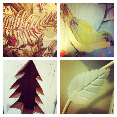
| 1. Birds 2. Fern |
 |
| 3. Fern 4. Bird 5. Tree 6. Leaf |
 |
| 7. Flower 8. Silhouette 9. Tree 10. Leaf shadow |
ABSTRACT
 |
| 1. Abstract triangle 2. Abstract square 3. Abstract rectangle 4. Abstract circle |
 |
| 5. Key Hole |
NON-REPRESENTATIONAL
 |
| 1. Bark 2. Shadows 3. Mud 4. Tree |
 |
| 5. Wall |
Planes
 |
| 1. The top of the water provides a plane. 2. The seat of the chair is a plane. 3. Of course, table tops are planes. 4. A distressed plane, AKA coffee table. |
 |
| 5. A worn out wall - plane. 6. A window pane is a plane. 7. A simple sidewalk provides a plane. 8. A circular plane. |
 |
| 9. This door is a plane. 10. The fence makes a plane.
--dm
|
Subscribe to:
Comments (Atom)


