Tuesday, July 24, 2012

Burlap Coffee Bags

This is not a "how-to" post but rather a "Look what you can do!" post. What is more southern than some rugged burlap? But this blog is about being southern & chic. Here are some ideas to make boring burlap chic


First it is important to know what kind of burlap to get and use. Personally, I suggest finding REAL coffee bags - they have an obvious real look. You can get coffee bags for only $10 here


Coffee bags come in so many different colors, words, and sizes. It is important to look through details and choose the one you like best. You never know, your guest may read it and if it says something awkward, well, that could be awkward.


The texture is also something to consider when picking your burlap. If you are making something that people skin may touch (i.e. pillow, seat cover) you want to make sure not to choose an itchy burlap. An itchy burlap will not make your guest want to stay and get cozy - ouch!


Here is an example of newer, unused burlap. This is pretty and crisp. It all depends on personal taste and what matches your decor.


This bag was turned into an ottoman cover. It is simply the top square and a beige cloth was used for the sides. I like the beige being used because it lightens it up - the entire ottoman burlap may be a bit much.

These are two examples of how burlap can be used on a chair:


This photo was used as a backing for a recovered chair and it adds so much to any table setting. If you found a scratchy/itchy burlap that you just love, this is the best place to use it. This picture is an example of  Notice the green color and pattern on it. This is what I was mentioning before about looking and choosing a burlap that fits what you want - believe me, it matters!


The second photo is perhaps the simplest thing one can do with a simple burlap. Just recover a seat! This is where it is really important not to use a scratchy burlap. People will be fighting NOT to sit in it.


And lastly, make a pillow! These burlap pillows can add a little something to any room. Imagine this on a crisp, white couch - How lovely that would be. Here, again, do not use an itchy burlap for a pillow.


And another example of a pillow. They can really give some character to a character-less room.

If you don't feel like searching for burlap and making your own, you can purchase each of these items here.

The main thing here is to have fun with your burlap searching and creating!

And as always, let me know if you have questions or comments!


Wednesday, July 18, 2012

For the college student

So you or your college student has lived in the dreadful dorms for a year and it is now time to pick a place and make it your own. If you are like me, and want to keep your bedroom at your parent's house just how it was when you left, then you have a task a head - find/buy things for the new place.

This can be expensive ($$$) and overwhelming. You want to choose a color palate or fabric or piece of furniture to design your room around and I do not have many suggestions on the best way to do that, [just choose something you love and make it work] but I wanted to share a unique and creative idea with you.
Mantel/headboard purchased here.

Instead of an expensive, brand new, cherry wood (out of style) bed, create your own! Shop your local antique or thrift stores for a mantle to use as a headboard! If you don't like the color, simply change it to fit your style. The key here is to find one a decent price, do not pay a fortune or you might as well have gotten a brand new Haverty's bed. 

Trust me, your roommates will love your room and think it is just the coolest. The next thing you know, they will be hunting for similar things to change up their boring rooms!

I hope this sends a little inspiration your way. Just because you have a low budget doesn't mean your college bedroom can't be adorable and a room you LOVE! 

If you have any questions or comments, leave them below! I would love to hear from you!

Dani

Friday, June 29, 2012

Interior Design Links

My criteria for choosing interior design sites was the aesthetics of the furnishings, decor, etc. If the site contained items that were not of my liking, I generally did not choose the site to post. If the items were something that I would like to use in my own home was a large part in the decision to post.

I really like Decor Happy because it has a variety but still all in my aesthetic liking. Too much of a variety makes me lose a sense of focus.

Thursday, June 28, 2012

Items for Room

Living Room:
Sofa
Coffee table
Window coverings
Media Console


Dining Room:
Lighting
Table

Design Ideas

I like this chair because it looks comfortable.

An inviting white couch is what I've always wanted.

I love everything about this couch and wall decor!

This one is more simple but is smaller which may work better in my space.

I love the mix from crisp and crackle.

I like the color wood here.

LOVE this linen chair.

A neutral decor for either room.

This would be a great room divider! Would like it in a light wood.

This would be a nice accent for room decor/media.

Color Ideas

Living room:

Dining room:


Monday, June 25, 2012

The Last Principles of Design

PROPORTION
1. Items found nature are always proportional.
2. The stairs are proportional to the room and create balance.
3. The chairs are proportional to the table. If they weren't the chairs would be too small.
4. The pillows create balance on the sofa.

UNITY
1. The repetition in color helps to create unity here.
2. The repetition of the the texture creates unity throughout this wall.
3. The repeated triangular shape represents a sense of unity.
4. The repeated columns make a unity in the fasade of the building.

VARIETY
1. The variety of color, form, shapes and textures shows variety.
2. The pop of color, different textures, and unique forms and shapes provides unity.
3. This room moves the eye throughout with the many different elements.
4. This last photo also has the eye moving throughout with the different elements of design.


--dm


Redesigning a Room

Don't judge these photos.


1. I plan to redesign this room.
2. I plan to make this room a more functional room. It is large and needs to have the space used to its potential. 
3. This room is for my boyfriend and I and it is a living room and dining area. 
4. It is needed to improve the function of the space.
5. I will proceed by clearing out the space, perhaps adjusting some doors or windows, and changing color and placement of furniture.


--dm

Thursday, June 21, 2012

Breaking Down a Space

Shapes - movement - form - lines - balance - proportion - emphasis

--dm

Designer Links

My criteria for choosing designers was first of all choosing a site that was aesthetically pleasing. As a designer website, I find it very important for the website to give some sort of sense of good design even though they may not do graphic design. Secondly, I briefly went through the galleries or photos on the websites to see if the designer's designs could potentially be something for me.

Cullen and Co. is my absolute favorite designer out of the ones I posted. It is my favorite because it grasps me at first glance. The photos are one of a kind and show detail of what is possible with this designer and I love it!

--dm

Some Principles of Design

Balance
SYMMETRICAL
1. This piece with the windows and cabinets alike, creates symmetrical balance - decor excluded.
2. The way the bed is made is symmetrical balance. This is done on purpose.
3. The structure here is symmetrical balance with the design placement of the windows.
4. The planters and bulldogs on either side of the door create symmetrical balance.

ASYMMETRICAL
1. The lamp and the tall-back chair create an asymmetrical balance.
2. The decor on these shelves are not the same, however appear balanced.
3. The structure of this hosier is asymmetrical yet has a sense of balance visually.
4. The picture placement and lamp are not symmetrical but create a balance. 

RADIAL
1. The plates in a stack are a form of radial balance.
2. The dining light fixture has elements around a focal point.
3. This awesome sign has the words in a radial balanced position.
4. The concrete man hole as elements around a center point that are balanced.

Emphasis
COLOR
1. Here, the emphasis is the pop of pink on the otherwise dull table. The eye is drawn to the pink.
2. The teal drawer is the focus of this image.

SHAPE
3. The diamond shapes at the top of this mirror catch the eye and elongate the mirror.
4. The oval mirror is the focus of the picture and the eye travels after.

SCALE
5. The over-sized headboard is the focus of this image.
6. The bench here has a large back that is the emphasis.

Repetition & Rhythm 

1. The tiles form circles that are repeated in this floor.
2. The columns repeat in this image creating repetition.
3. The booths here repeat throughout the restaurant.
4. The lines repeat in this photo obviously creating repetition.

5. The pattern in the pillow repeats throughout creating movement.
6. The ceiling tiles repeat multiple times creating repetition.

Movement
1. The repetition of the windows create a movement to the left.
2. The lines down this walkway create a movement down the hall.
3. The curved wooden  walls create movement down this hallway.
4. The birds in this art piece are an absolute creator of movement.


--dm


Wednesday, June 20, 2012

Texture & More Space

Texture
ACTUAL
1. The furry blanket is a playful accent to any room.
2. The textured bathmat catches the water and provides a comfortable place to step!
3. It may not be cozy, but exposed brick in a home provides a strong sense of texture.
4. The beveled dots on this milk glass vase are interesting texture to look at. 

IMPLIED
1. The chair cushion looks rough like burlap when it is actually the color of threads used to create such a look.
2. The plain wooden "e" was painted to imply texture. The "e" appears metallic.
3. The counter top is an implied texture, it is smooth but does not appear that way.
4. The f aux wood floors imply a wooden texture when they actually are not. 

Space...Again
IMPLIED

The way the chairs are set up creates implied lines The way the furniture is placed, forces conversation.

The implied seating here separates diners from others. It creates a personal space.


--dm

Tuesday, June 19, 2012

Form & Space

Form
 GEOMETRIC
1. Here the form is a circle drawing in the eye.
2. Here the rectangular form works well for storing things.
3. The pillow is a square form to provide comfort - gotta love that fabric too!
4. These metal balls are a form and are simply used for display.

NATURAL
1. The pine cone is a natural form.
2. The logs are a form in nature.
3. The light sticks are a man-made form of something natural.
4. Of course, flowers are a natural form!


ABSTRACT
1. The burnt candle represents an abstract form of a cylinder.
2. The lamp bottom is also an abstract form of a cylinder.
3. The ball is a abstract form of a circle because of the rough surface.
4. The spiral tree is an abstract form.

NON-OBJECTIVE

1. This water equipment is bright & shiny but not a specific recognizable form.
2. My wrapped breakfast bagel does not take the form of a circle, it is simply non objective.
3. This wall of mirrors are forms of circles but the overall piece is non objective to me.
4. The birds nest is perhaps an abstract circle to some, but to me it is non objective.
STATIC

1. Here, the horizontal and vertical lines equal out making a static image.
2. The desk and the suitcases create calming and stable horizontal lines - static.
3. The bench has calming horizontal lines and there is no movement.
4. Again, these shelves are horizontal and do not show movement.

DYNAMIC
1. Here, the image has movement, the eye travels from front to back throughout.
2. I found this online but the round balcony above shows so much movement I couldn't resist.
3. The desk at the bottom catches the eye and then travels up.
4. The round table has the eye moving around the table.


Space
ACTUAL
The walls show that this is an actual interior space.
 IMPLIED
With the rug, chairs, couch, and coffee table, this presents an implied space.
There may not be walls but the lines are implied.

--dm


Monday, June 18, 2012

Shapes & Planes

Shapes


GEOMETRIC
1. Circle       2. Square
3. Oval         4.Square

5. Rectangle       6. Diamond

7. Rectangle         8. Triangle
9. Diamond        10. Circle


NATURAL
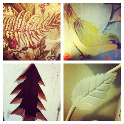
1. Birds        2. Fern
3. Fern       4. Bird
5. Tree      6. Leaf
7. Flower      8. Silhouette
9. Tree         10. Leaf shadow


ABSTRACT
1. Abstract triangle       2. Abstract square
3. Abstract rectangle    4. Abstract circle

5. Key Hole


NON-REPRESENTATIONAL
1. Bark         2. Shadows
3. Mud             4. Tree

5. Wall


Planes

1. The top of the water provides a plane.
2. The seat of the chair is a plane.
3. Of course, table tops are planes.
4. A distressed plane, AKA coffee table.

5. A worn out wall - plane.
6. A window pane is a plane.
7. A simple sidewalk provides a plane.
8. A circular plane.

9. This door is a plane.
10. The fence makes a plane.


--dm